From the Chicago Reader, February 4, 1994:
ON THE BRINK OF ABSTRACTION:
JULIA
FISH
at Feigen,
through February 19
By Fred Camper
There is an aggressive, even imperial aspect to mainstream Western art.
From the monumental equestrian statue that etches its man-atop-horse form
into the sky to Jackson Pollock's huge drip canvases, large enough to seem
alternative landscapes, artists have placed an assertion of the human personality
their subject's or their own at the center of their works.
In our century a different tendency has emerged, most often in the work
of women artists. In the abstract paintings of
Agnes Martin,
Helen Frankenthaler, and
Mark Tobey, in the gentle interiors and star paintings of
Vija Celmins,
and in the observational street photographs of Helen Levitt, one finds
artists less interested in asserting their identity and not interested
in remaking the world. The viewer is asked to focus less on grand themes
a victory in battle or the outline of a subject's soul than on tiny
and apparently insignificant details. The artist who concentrates on minor
variations in pale colors placed between ruler-straight lines or on the
momentary poses of street kids offers no explanation for the order of things,
no heroic imagery. But this apparently narrower focus can offer a complete
vision, one asserting that it is not given to humans to rule or even understand
the whole word that we can realize our best selves through a double journey,
one that marries external observation with inner vision.
I was not surprised to learn that Julia Fish cares very much about the
work of Martin, Tobey, and Celmins, among other  painters.
Her recent paintings and drawings, seven of which are currently on view
at Feigen together with five 1991 works in a downstairs office have
simple subjects. But the longer I looked, the more my experience of them
deepened. I was led less to identifiable themes, a definitive "vision of
the world," than to a deepening of my own inner awareness.
Fish's paintings have simple titles that do no more than modestly name
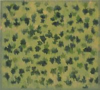
the subject that inspired them. Ivy is a green rectangle inside
a slightly darker border, within which float leaflike shapes. Fuzzy at
their borders and lacking precise details, these are hardly anatomically
correct leaves. Many are partly covered by gray-green blotches that could
be mistaken for areas where the paint has been partly scraped away, dulling
the color. Much of the work's power stems from such ambiguities. The leaves
hover against a green background, sometimes seemingly in front of it, sometimes
sinking into the dense green.
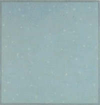
Flurries is my favorite work of the twelve. White flakes are
set against pale blue, again surrounded by a thin framelike band.  Though
the title suggests falling snow, there is no illusion of movement; the
viewer is suspended in time.
The apparent simplicity is deceptive. The blue background is actually
complexly textured, with patches of green and lighter blue; behind it lie
hints of tan, green, and yellow. Fish paints very slowly, building her
surfaces out of translucent layers of oil paint. Thus the perceived depth
effects in her work are not created by the "tricks" of Renaissance perspective
but by piling up layers of paint a technique that, in different forms,
is as old as van Eyck. But if layering in van Eyck creates hyperreal colors,
Fish's colors are more tenuous, ethereal, changeable.
The subject-background relationship in Flurries is similarly
ambiguous. The white forms are not discrete; while their edges don't exactly
bleed into the blue, they aren't utterly separated from it either. The
pale blue itself seems suffused with white. As a result, it seems wrong
to call the flakes the "subject" and the blue the "background" they are
equal partners in an amazingly gentle balance.
In many Renaissance portraits, perspective is used to articulate a relationship
of dominance: the wealthy merchant is shown against a window-view of his
city, which seems subservient to his controlling gaze. Fish has (as have
many of her colleagues) rewritten the power relations inherent in the traditional
painting of figure and ground. Snow and sky are equal but not merged; the
viewer can see one and then the other as foreground, and then see them
both on the same plane. After several minutes of viewing, the picture presents
all three possibilities at once. It is quiet yet alive, still but not static.
I felt the "still active equilibrium" Fish says she seeks.
Several of the paintings can be read in alternate ways Flurries
as stars, Tide as a hilly landscape framing a mottled, multicolored
sky. The interplay between definite if indistinct forms and Fish's variegated
surfaces captures what Fish calls her "negotiation" between abstraction
and representation. The viewer stands as if on a threshold, looking inward
and outward at once: the external world constantly hovers on the brink
of abstraction, yet never disconnects from its roots in nature.
Fish, 43, grew up in a tiny town on the Oregon coast. Her parents encouraged
reading, drawing, and music and chose not to have a television. She remembers
"the tall forests and the Pacific horizon line" as formative presences.
Additional painting influences have included Romanesque mural painting,
Mondrian, and Monet. On first arriving in Chicago in 1985, she made paintings
based on her memories of Oregon landscapes. More recently, Fish, who is
a professor of art at the
University of Illinois at Chicago, has taken
inspiration from local sights.
Walk appears to depict rectangular paving stones or perhaps an
indoor tiled floor. Dark brown lines divide the tall rectangle of the canvas
into smaller, lighter brown boxes. No box is perfectly rectangular, no
line perfectly straight. The lines meet at slightly skewed angles; they
sometimes widen slightly around such intersections. The central contrast
is between geometric order and organic irregularity. Though the picture
seems dominated by its geometric configuration at first, it is the tiny
deviations that become most striking. What becomes strangely moving in
this work is the subtle difference between an 89-degree angle and a 91-degree
angle a far cry from the grand gestures of Renaissance battle paintings
or of some modern abstract canvases.
This is not a narrowing of focus but rather a redefinition of what it
means to be human. Our attention should be directed not toward remaking
the world in our image but toward discovering the possibilities for spiritual
redemption in observations of the simplest of things. I was reminded of
William Blake's line "
To see a World in a Grain of Sand."
Each of her four Garden drawings on view are black-and-white
clusters of diverse biomorphic forms. While Garden #1 has empty
space between the shapes, the others are more densely packed; in Garden
#23, shapes are superimposed on each other and virtually no white paper
is visible. These improvisations on plant shapes are highly suggestive
a garden of the imagination. These drawings are made on paper printed
with a grid apparently intended for Japanese calligraphy practice. While
the regularity of the grid makes an interesting contrast with the garden
shapes, I also thought of the long connection between calligraphy and landscape
painting in Japanese and Chinese art. Learning calligraphy was thought
to be the beginning of all artistic training, even more than figure drawing
was for Western artists; a close examination of older Japanese paintings
shows how much the brush strokes owe to calligraphy. The implication is
that Fish's shapes might form a new vocabulary.
Downstairs are four untitled "water drawings." Similar in most respects
to the Garden works, they are on unlined handmade paper, and the
shapes are much simpler short, wormlike oblongs. As in Walk, I
sensed momentous implications in tiny variations between shapes. Yet while
focusing on tiny variations, I felt my mind starting to clear of all the
usual preoccupations money, friends, sex, the future, the budget deficit,
the death penalty. To quote Fish, everything became "very still," and I
was transported to a rare, silent place. Later, I recalled having seen
four amazing "Seasons" landscapes by the great 15th-century Japanese landscape
painter and Zen monk Sesshu. While they depict the visible world with great
skill, the longer I looked at them, the more that world seemed to melt
away as if the differences between rocks and trees, or between one season
and another, were mere transitory phenomena hiding deeper truths. Any skillful
painter can depict the visible; it is a rare one who can take us beyond
the visible.
© Copyright Fred Camper 1994
Links in this article:
Vija Celmins
Chicago Reader
Feigen
Julia Fish
Helen Frankenthaler
Agnes Martin
Monet
Sesshu
Mark Tobey
To see a World in a Grain of Sand
University of Illinois at Chicago
Home Film
Art
Other: (Travel, Rants, Obits)
Links About
Contact
 painters.
Her recent paintings and drawings, seven of which are currently on view
at Feigen together with five 1991 works in a downstairs office have
simple subjects. But the longer I looked, the more my experience of them
deepened. I was led less to identifiable themes, a definitive "vision of
the world," than to a deepening of my own inner awareness.
